Matching patients and professionals, in a couple of clicks.
Matching patients and professionals,
in a couple clicks.

Matching patients and professionals,
in a couple clicks.

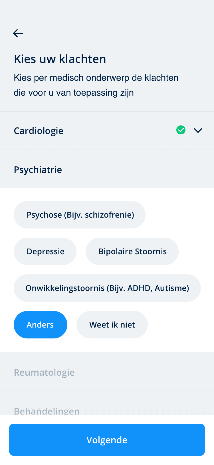
UMC Utrecht, one of the leading academic hospitals in the Netherlands, aimed to streamline its patient-professional matching process for medical research. The objective was to design a user-friendly mobile application that would connect patients with medical professionals.





UMC Utrecht's existing patient-professional matching process involved a unmanagable manual system, causing delays and inefficiencies. Our primary challenge was to create an intuitive, user-centered mobile app that would simplify this process, making it easier for patients to engage in medical research and find more relevant studies for both.




1
User Interviews
I interviewed both patients and medical professionals to understand their pain points and expectations.
Competitive Analysis
I analyzed similar applications in the healthcare industry to identify best practices and areas for improvement.
User Personas
I created personas to guide the design process and ensure that the app catered to the specific needs of different user groups.
2
Based on the insights gathered during the research phase, I began wireframing and prototyping the app. Key steps in this phase included:
Low-Fidelity Wireframes
I created low-fidelity wireframes to map out the app's structure and flow, focusing on usability and functionality.
User Testing
I conducted usability testing sessions with potential users to gather feedback and iterate on the design.
1
After analyzing user feedback, I made iterative improvements to the wireframes and created high-fidelity prototypes. This stage involved:
Visual Design
I refined the app's visual aesthetics to ensure a clean and user-friendly interface and iterated on it.
Usability Testing Iterations
I continued to conduct usability testing with the high-fidelity prototypes, incorporating user feedback into design refinements.
1
User Interviews
I interviewed both patients and medical professionals to understand their pain points and expectations.
Competitive Analysis
I analyzed similar applications in the healthcare industry to identify best practices and areas for improvement.
User Personas
I created personas to guide the design process and ensure that the app catered to the specific needs of different user groups.
2
Based on the insights gathered during the research phase, I began wireframing and prototyping the app. Key steps in this phase included:
Low-Fidelity Wireframes
I created low-fidelity wireframes to map out the app's structure and flow, focusing on usability and functionality.
User Testing
I conducted usability testing sessions with potential users to gather feedback and iterate on the design.
1
After analyzing user feedback, I made iterative improvements to the wireframes and created high-fidelity prototypes. This stage involved:
Visual Design
I refined the app's visual aesthetics to ensure a clean and user-friendly interface and iterated on it.
Usability Testing Iterations
I continued to conduct usability testing with the high-fidelity prototypes, incorporating user feedback into design refinements.


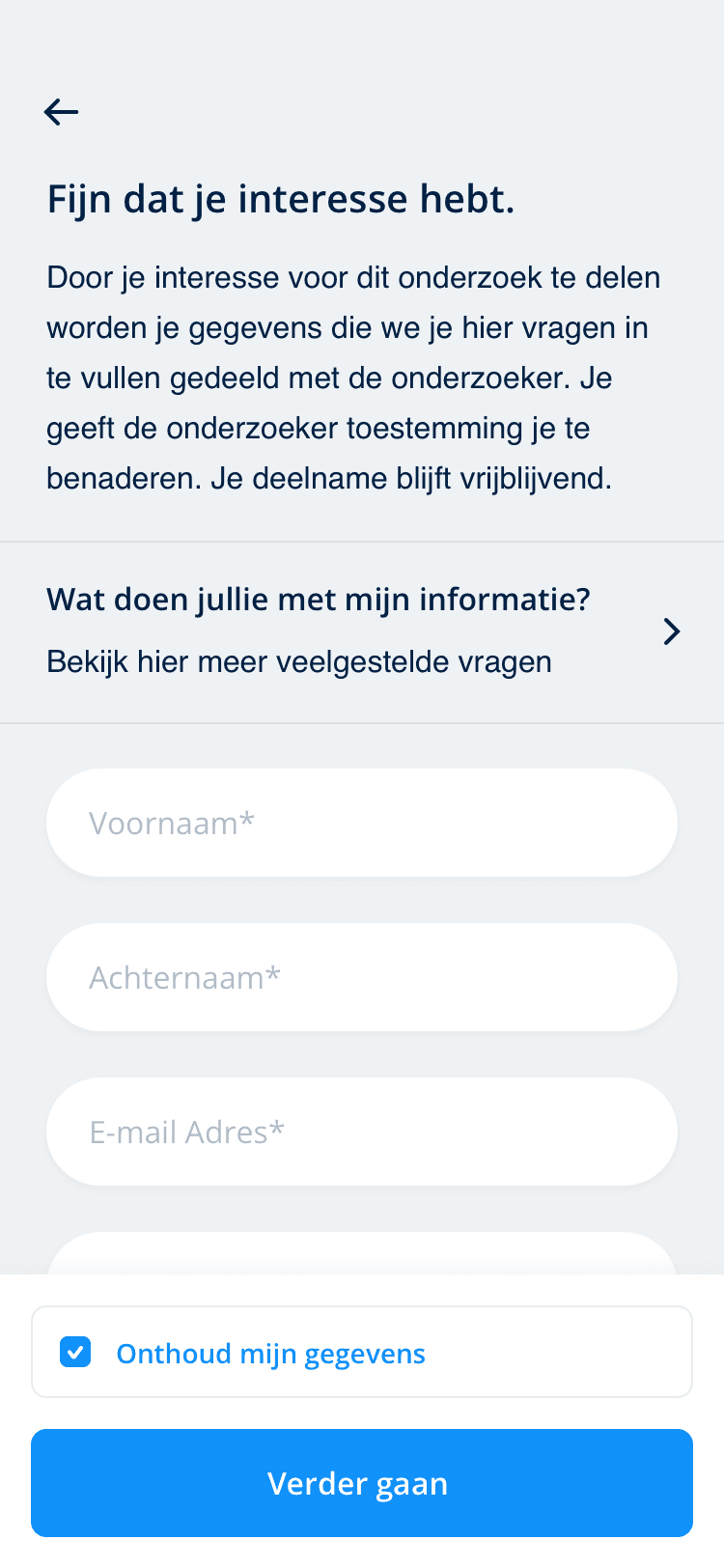

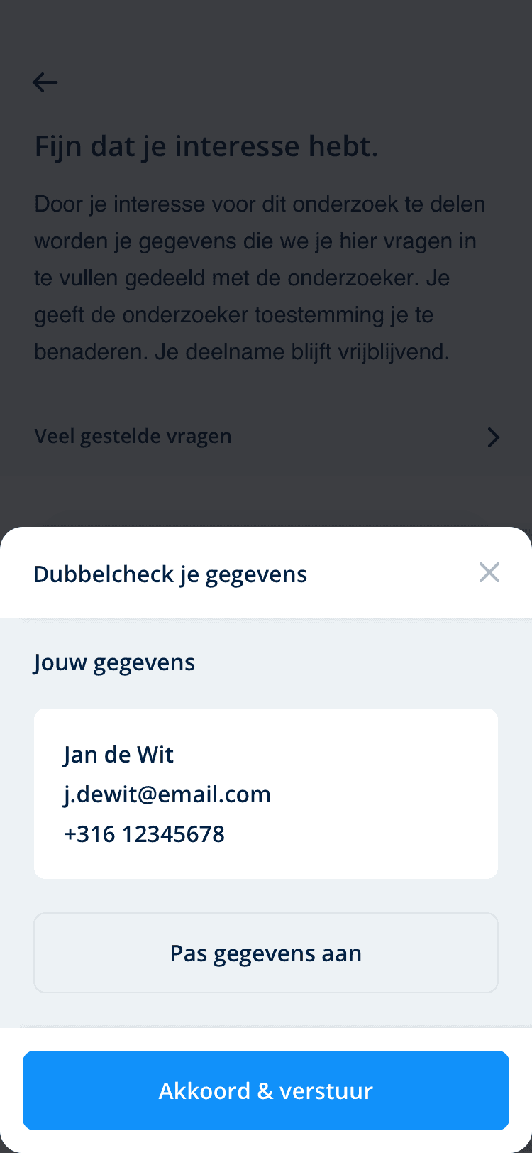

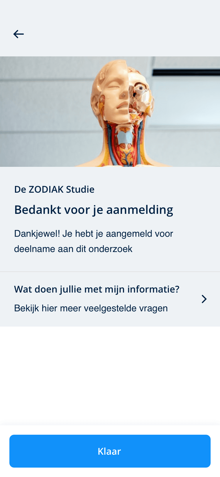


Enhanced User Satisfaction
By directly addressing user pain points and incorporating their feedback throughout the design process, the app offers a seamless and satisfying user experience for both patients and professionals.
Improved Efficiency
The app streamlines the process of matching patients with relevant medical research opportunities, saving time for both parties and increasing participation rates in studies.
Validated Design
Continuous usability testing and iteration have validated the design, ensuring that it meets the high standards of usability and functionality required in the healthcare sector.

STEP 1

STEP 2


STEP 3


STEP 4


STEP 5


STEP 6


STEP 1


STEP 2


STEP 3


STEP 4


STEP 5


STEP 6
©2024 Kubilay Sapayer
©2024 Kubilay Sapayer